Live Well Team
1 Faculty Advisor
1 Fellow
1 Graduate Student
3 Co-ops
CBDI Team
Multidisciplinary Clinical Team


Making daily rounds more efficient and effective
Rounds is perceived as a valuable, collaborative tool for clinicians and families — nursing staff provide up-dates from the last 24 hours, clinicians discuss treatment options and create a plan for the next 24 hours, and families can ask questions to multiple providers in one setting. Unfortunately, the existing process for planning and executing patient’s rounds is both inefficient and ineffective, and frequently results in inconsistent participation from key stakeholders.
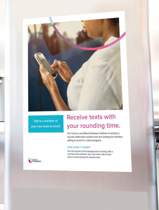
Scheduling and notifying key stakeholders, including core team members and specialists is a daily process of “seek and find.” Furthermore, patients and their families are given a 4–5 hour window for when they can expect the rounds team to arrive. This causes additional stress, inconvenience, and frustration. Decisions to bathe, use the restroom, or eat meals outside of the inpatient room are often postponed for fear of missing the daily rounds. How can we design a daily rounds system whereby scheduling and participation is easier, and patient and family satisfaction is improved?
Live Well Team
1 Faculty Advisor
1 Fellow
1 Graduate Student
3 Co-ops
CBDI Team
Multidisciplinary Clinical Team


Improve patient/family satisfaction and minimize uncertainty by empowering patients and families to be involved in care decisions made during rounds.
A 4–5 hour window of waiting for the arrival of the rounds team every morning is an incredible inconvenience, leading to increased stress and frustration, and reduced participation by patients and families.
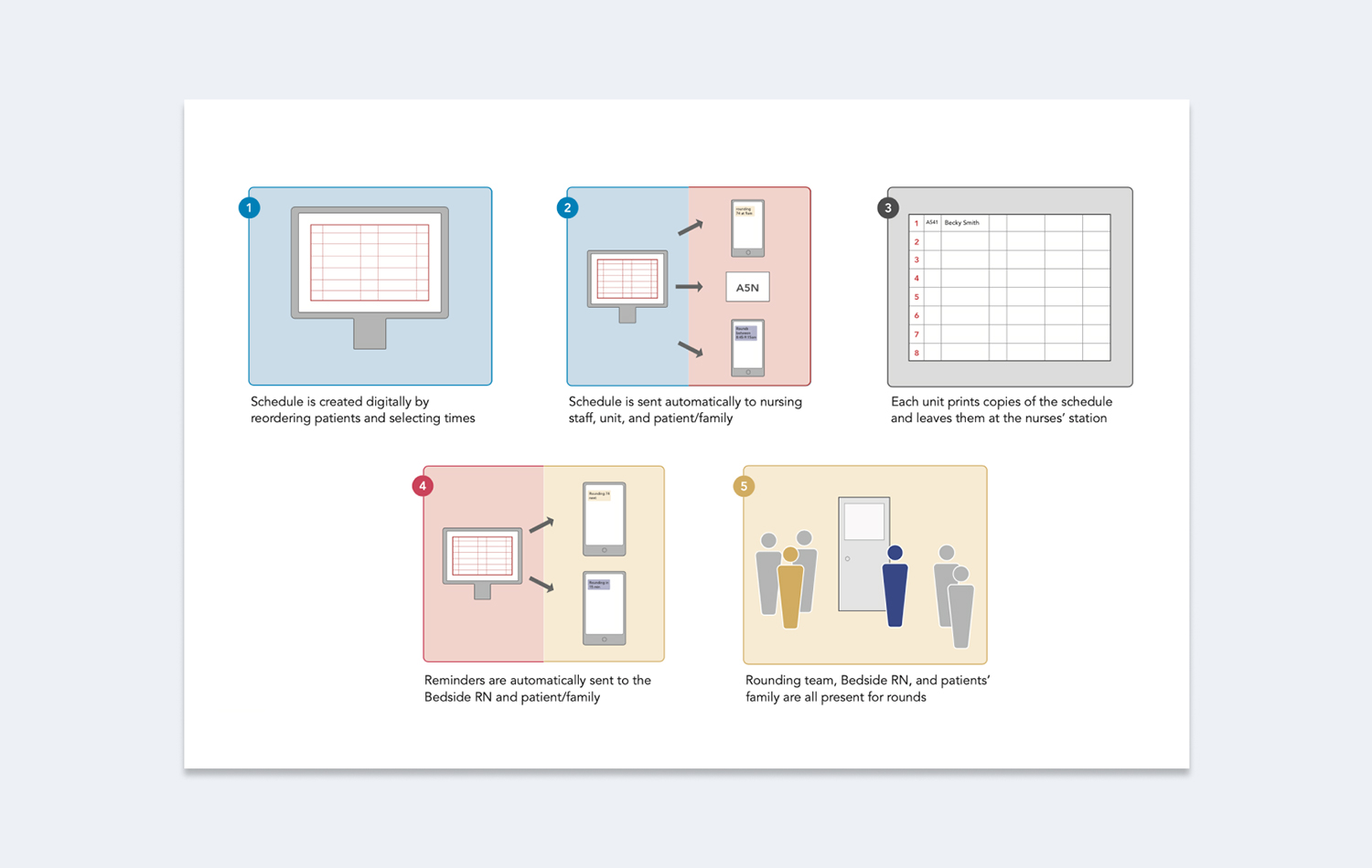
The existing paper-based system requires individual rounds team members to create and self-manage their own rounds schedules. A digitally created and disseminated schedule along with timely automated notifications can improve the efficiency and effectiveness of the system.
100
26
02
For six months, a trans disciplinary team of researchers spent over 100 hours shadowing the rounds team to inform the design and guide the evaluation of two proof-of-concept pilots.
Six families and twenty nurses were interviewed to better understand the unique expectations, needs, and desires, of these two key stakeholder groups.
Based on the extensive research, two proof-of-concept prototypes were designed and evaluated by eight clinicians across two different departments.
What We Did
Shadowing
Questionnaires
Journey Map
Wireframing
UX/UI Design
Prototyping
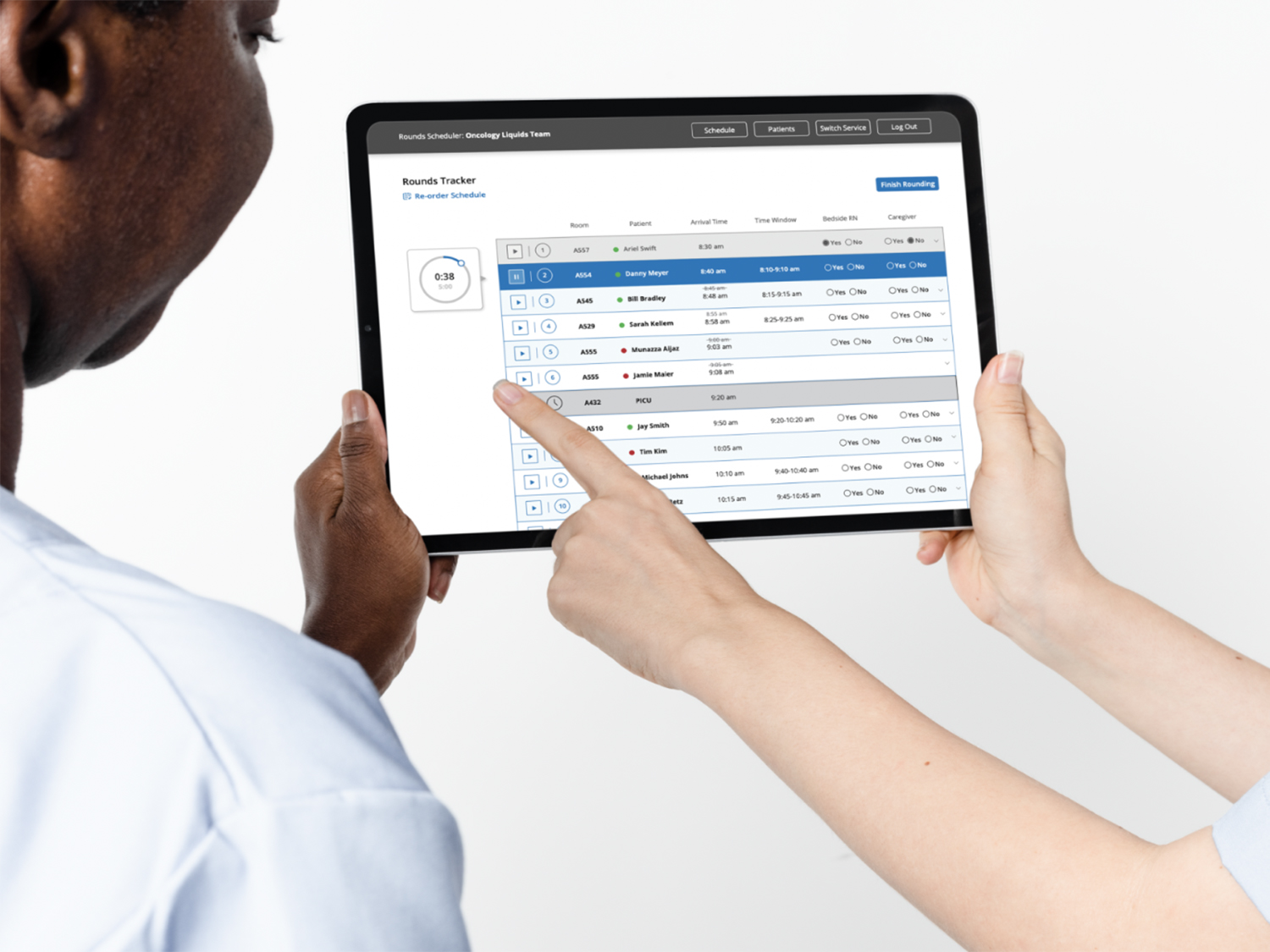
A minimum viable product was created consisting of an Application Programming Interface (API) and accompanying User Interface (UI) style guide. A minimum viable product is a version of a product with just enough features to be usable by early customers who can then provide feedback for future product development. A comprehensive understanding of the existing workflow model revealed several major pain points in the process. While many pain points were shared across stakeholder groups, some were unique to specific groups. Each User Experience (UX) concern needed to be appropriately addressed in the product’s UI. Schedulers needed a solution that closely mimicked their existing paper-based workflow while leveraging the efficiencies of digitization, such as dragging, dropping, and moving existing patient information modules instead of having to do data entry every single day when creating the rounding schedule. Rounds teams needed all the scheduling information to be readily accessible via their mobile workstations, and real time captures of when meetings started and finished to assure that specialists could drop in/out of rounds only when their services were needed. Patients and families needed advanced notice of when the rounds team was expected to arrive so that they were able to plan their day accordingly.
IMPACT
The use of application has been spread to 8 services within Children’s Hospital. Families are currently enrolled to receive text time notifications and updates. The project team is continuing to work towards hospital-wide spread and optimization of the application which will include automated notification to bedside nurses.
